


Some developers rarely think about design: they are given beautiful mockups from a UI designer, and are tasked only (only? 😂) with writing the code to bring it to life.
For other developers, however, the task of design falls mostly — or completely — on their shoulders.
Whether you're working solo on a personal project, or for an organization without an in-house designer, if you find yourself staring down the UI design process on your own, here are 5 tips to guide the way:
1. Keep The Color Scheme Simple 🎨
While websites like colorhunt or coolors are fantastic resources for color scheme inspiration, when it comes time to implement the colors in your application, 4-5 colors is simply too many to work in effectively.
Try this instead: Simplify! Use a color scheme generator as a jumping off point.
Choose a scheme you like, then narrow it down to your two favorite colors. Add in a dark neutral (I like #444444) and a light neutral (#F6F6F6 or the like) — 🚀 color scheme sorted!
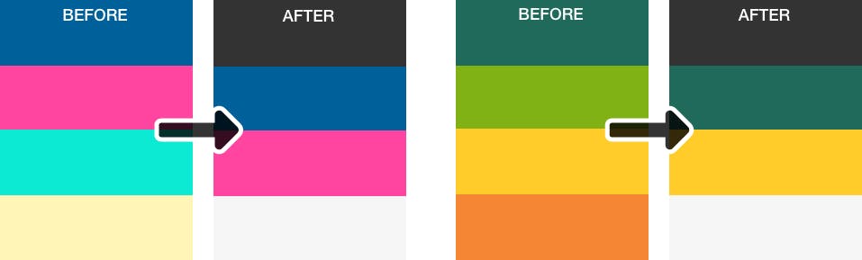
TLDR: Don't go overboard with color: pick a primary color, a secondary color, a light neutral and a dark neutral.
2. Negative Space Is Your Friend 🔲
Open areas in your design (aka 'negative space' or 'white space') let the eye rest and give the sections of the page visual separation. Negative space also pulls attention to the separated content, commonly seen in a hero section.
General guidelines for negative space:
- For headings, add space above to separate the heading from the previous section, and slightly less space below to tie it to the section it's heading up. A 2-1 ratio is good here: for example, if you use
top-margin: 1rem, usebottom-margin: 0.5rem. - For paragraphs, set
line-heightto somewhere between 1.3-1.7 — this lets the content breathe. Anything higher can decrease readability, however, so tread lightly. - Provide enough space between sections of your design so that the change in section is clear to the user.
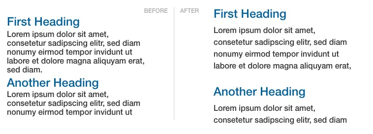
TLDR: The more negative space, the better. Margin + Padding + You = 💞
3. Establish Visual Hierarchy ❗️
When all of the elements on the page are the same visual weight, users don't know where to look or what to do.
Ask yourself: what is the number 1 thing I want someone to do in this section of my application?
That thing should stand out visually — whether that's in terms of size, color, font weight, or spacing.
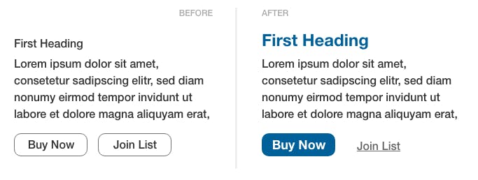
TLDR: Make the #1 thing you want users to do in each section of your application stand out.
4. Be Mindful of Alignment 📶
Grid-based layouts are popular for a reason — they're visually appealing because the grid gives the design elements natural alignment.
Every element that takes up space in your application creates invisible lines of alignment, extending horizontally and vertically from the edges of that element.
This means when you add new elements, they'll look best if they line up in some way with the elements already on the page.
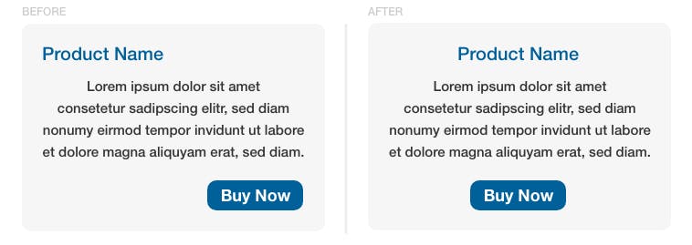
In the before example above, the elements are out of alignment: the heading is aligned left, the body copy is aligned center, and the button is aligned right.
Now check out the after: when you align all three elements in the same manner, the design looks more cohesive and effective. Note: This logic applies to all elements, not just text!
TLDR: Be consistent with your alignment: text within blocks should be similarly aligned, and try to line up new blocks with other blocks already on the page.
5. Research Effective Examples 🌅
Put on your spy goggles, it's time for some research!
Think about successful competitors in your genre, then choose one and visit their application. Take a few minutes to examine the design. What do you like? What don't you like? Brainstorm how can you implement your findings into your application.
If you don't have any competitors, visit a design inspiration website and perform the same exercise with websites in a similar genre.
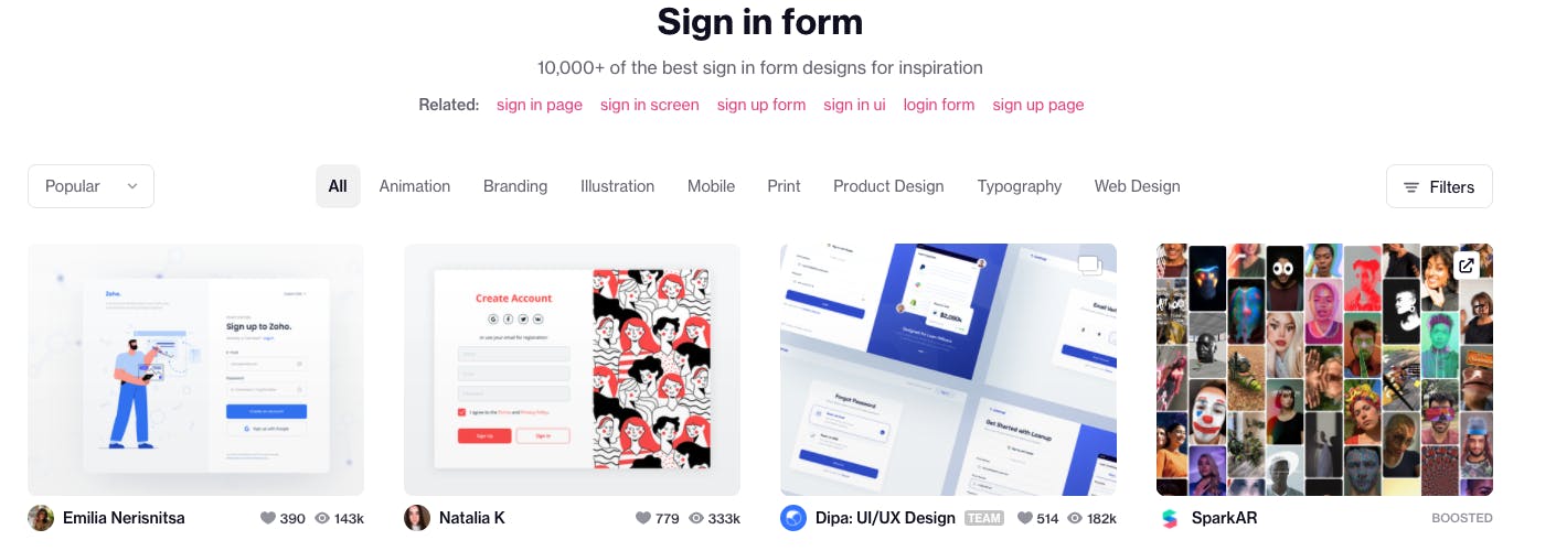
Stuck on the design for a particular component of your application (like a sign in form or a product page) instead? Look for design inspiration by entering in the component type on dribbble — there are examples for just about everything!
While researching, try to notice the things we've talked about above: color scheme, negative space, visual hierarchy, and alignment.
Warning: This can turn into a rabbit hole! Set a timer, and don't let yourself browse designs for longer than your timer allows!
TLDR: Don't reinvent the cheese wheel: borrow ideas from great designers who have come before!
With these tips in hand, you're set up to create beautiful designs that bring your ideas to life! What's your favorite UI design tip? Let me know in the comments!
TLDR: 1. You don't need a bunch of colors, just a couple are perfect. 2. Add white space everywhere: headings, paragraphs, sections, etc! 3. Make the most important thing on your page stand out. 4. Line things up: text, containers, etc. 5. Gather inspiration from others!